Enhanced Data Profiling in Power Query: GUI and Table.Profile Function with 2nd Argument

Hello Data Enthusiasts!

Sometimes, it’s important to check how good your data is in your tables. Even though you usually do this when getting the data ready to find out if there any outliers or issues with your data for correction, it’s handy to have a report for regular users too. That way, if they see something strange, they can understand why. Adding a data profiling report tab to your Power BI report helps spot any weird stuff in your data. In this guide, I’ll show you an easy way to make one. I will also show you how to use the GUI data profiling options as well as the function Table.Profile, leveraging the 2nd argument of it to create additional information columns about your data.

Let’s see what Data Profiling is. Data profiling means digging deeper into your data to understand it better. It’s like finding out how many different values there are in a column, what the highest and lowest values, standard-deviation, the average, and other statistics like that. Data profiling basically helps you learn more about your data.

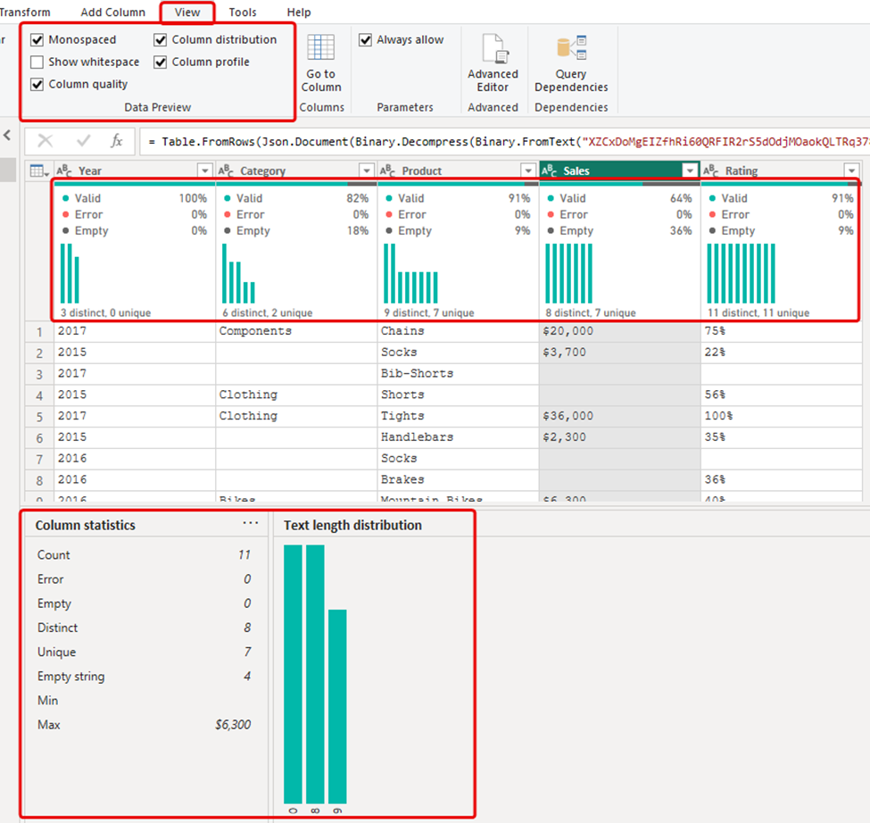
In Power Query Editor, there’s a section for data profiling that helps you understand your data better as you prepare it. You can find it by clicking on the View tab. This shows you details about your columns, like the quality, profiling  and distribution of your data in Power BI Desktop and Microsoft Excel.


However, there are a few drawbacks to using this feature. It only lets you see the stats for one column at a time, and you can’t save the result as a separate query to share with others. Fortunately, Power Query has a function called Table.Profile. This function provides a table showing all columns and their data profiling info as a table output.

Table.Profile(table as table)

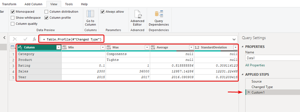
To use it, simply add a new step and use a table as the parameter to Table.Profile Function, which in this case is the previous step #”Changed Type”. This will generate a list of all columns in the table, each in its own row, along with all the statistics.

Now, with this data in a table in Power Query, you can load it into Power BI and make it available for users as well.

Table.Profile generates only these columns: Min, Max, Average, StandardDeviation, Count, NullCount and DistinctCount.

but it offers a second argument called “additionalAggregates,” which lets you include extra columns in the info it provides. The syntax looks like this:

Table.Profile(table as table, optional additionalAggregates as nullable list) as table

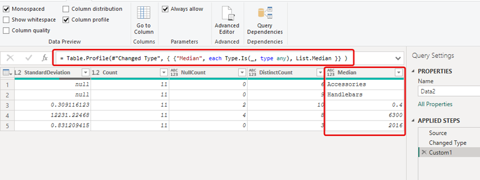
For instance, if you want to find the median of the columns in your table, which isn’t included in the default Table.Profile result, Here, I’ll show you how to add a new column named “Median” using the List.Median function.

Table.Profile(
#"Changed Type", 
 { 
    {"Median", each Type.Is(_, type any), List.Median }
 } 
)

You also have the option to create your own function according to your requirements to extract more information from your dataset. In our dataset, we encounter null and empty values in three columns.

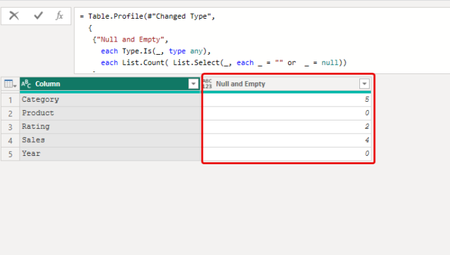
The “category” column contains empty strings, and both the “sales” and “Rating” columns contain null values. While Table.Profile provides details about null values in number columns with “Null Count,” it doesn’t show this information for text columns to display the count of empty strings. Therefore, we’ll create a function to identify these instances and show them in a single column, allowing us to observe both nulls and empty strings together. Let’s create this function to fill this gap.

Table.Profile(
  #"Changed Type", 
  {
    {
      "Null and Empty", 
      each Type.Is(_, type any), 
      each List.Count(List.Select(_, each _ = "" or _ = null))
    }
  }
)[[Column], [Null and Empty]]

The new column “Null and Empty” shows the count of nulls and empty string for each column.

In this article, you learned about using graphical tools for data quality and profiling. Then, we explored the Table.Profile function to see all the table columns at once. Finally, we used the second argument to add more stats to the function. I hope this article was helpful. Please leave your comments or questions below!

Download the PBIX file:  HERE

Spread the word
Scroll to Top