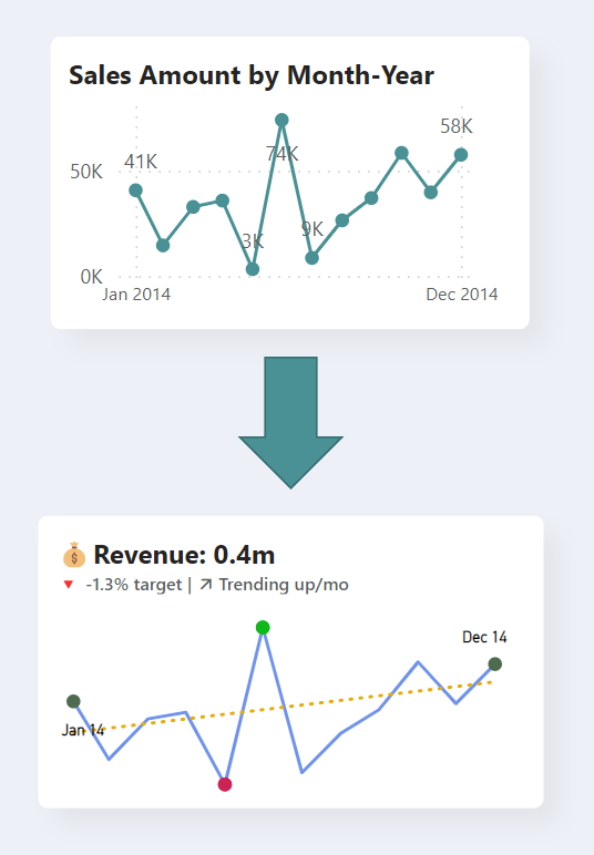
In this video tutorial, I’ll cover three key areas of transforming a line chart into a KPI visual. Firstly, I’ll show you how to use the dynamic title and subtitle feature to create a more engaging visual and add context to your KPI visual. By adding a dynamic title and subtitle, you can provide your audience with key information at a glance and help them to understand the significance of the KPI you’re presenting.
Secondly, I’ll demonstrate the new LINESTX DAX function. This function allows you to calculate the slope of the trend lines in your visual, giving you an even deeper understanding of your data. With this new feature, you can quickly identify trends and patterns in your data and make more informed decisions based on your findings.
Finally, I’ll show you how to use dynamic format strings to make your visual labels more dynamic and informative. By customizing the format of your KPI visual, you can highlight key information and ensure that your audience understands the significance of your data. With these dynamic format strings, you can customize the content that need to be shown for your data points.
By the end of this tutorial, you’ll have the skills you need to create a visually stunning and effective KPI visual in Power BI. Whether you’re looking to impress your audience or simply take your Power BI game to the next level, this tutorial is for you. So, let’s get started and learn how to transform a line chart into an insightful KPI visual using Power BI!


